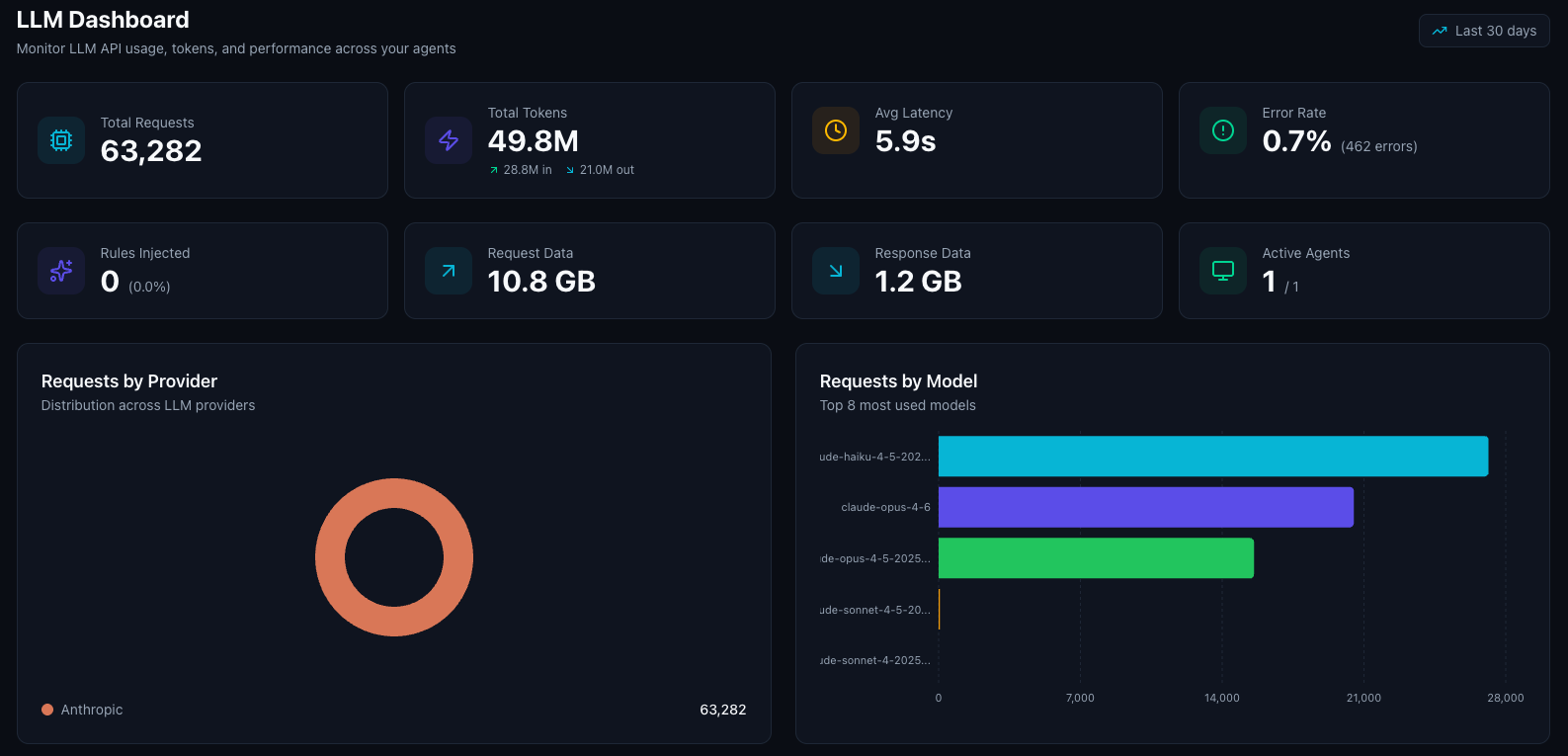
Key Metrics
The dashboard displays five summary cards at the top:| Metric | Description |
|---|---|
| Total Requests | Number of LLM API calls made through Turen (click to jump to LLM events) |
| Avg Latency | Mean response time from LLM providers |
| Error Rate | Percentage of failed LLM API calls, with error count |
| Data Volume | Total request and response payload sizes |
| Active Agents | Number of agents that sent LLM requests in the period (click to jump to fleet) |
Provider Breakdown
A pie chart showing how usage is distributed across LLM providers:- Anthropic: Claude models
- OpenAI: GPT models
- Google: Gemini models
- Mistral: Mistral models
- Cohere: Cohere models
Model Breakdown
A horizontal bar chart showing which specific models your team is using (top 8). Model names are displayed in a friendly format (e.g., “Claude Opus 4.6”, “GPT-5.2 Pro”). This helps you:- Track adoption of newer models
- Understand usage distribution
- Identify usage patterns across your team
Session Activity
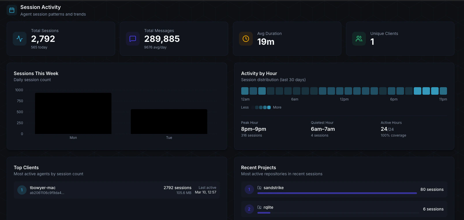
- Total Sessions: Number of Claude Code sessions in the period
- Total Messages: Messages exchanged across all sessions, with daily average
- Avg Duration: Average session length
- Unique Clients: Number of distinct machines with sessions
- Sessions This Week: Daily session count bar chart
- Activity by Hour: 24-cell heatmap showing when your team is most active
- Top Clients: Ranked list of machines with the most session activity, showing hostname, session count, total bytes, and last active time